restaurant examples
Real Sites (Examples), That Work.
A hungry visitor decides in seconds whether to stay or scroll past. Every example below is built around one thing: making them feel the place before they've even booked.
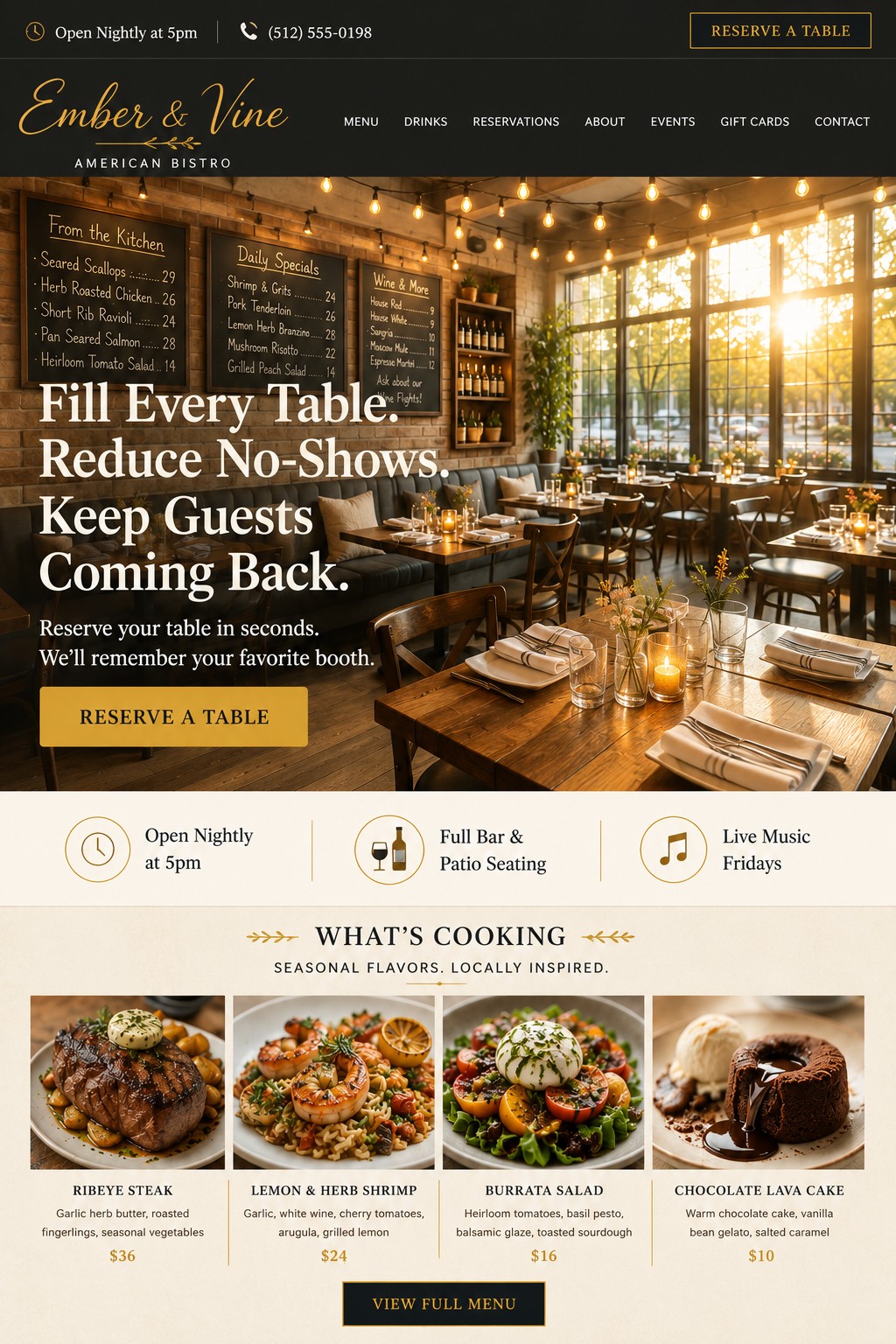
Ember & Vine — American Bistro
🕯️ Real chalkboard menus with legible dishes and prices do double duty as atmosphere and menu preview — no separate section needed to sell what's cooking.
✨ String lights and golden-hour window light make an empty dining room feel like somewhere you'd want to be tonight, not a rendering.
🍽️ The "What's Cooking" section with real dishes and prices turns browsing into wanting — the most concrete, appetite-driving section in the whole set.
Could be better: the header nav is a little crowded at seven items — could trim to the essentials and move the rest into a dropdown.
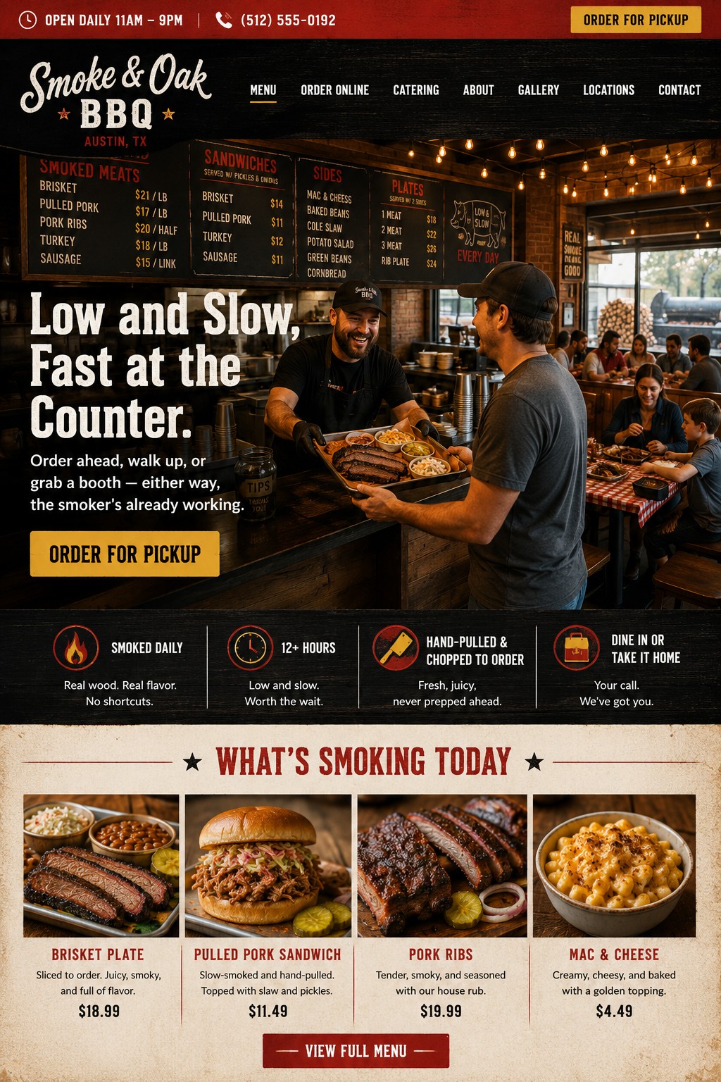
Smoke & Oak BBQ — Counter Service
🔥 The counter handoff — pitmaster mid-laugh, tray loaded, tip jar right there — captures real, busy mid-rush energy instead of a quiet staged shot.
🪵 A visible smoker and stacked firewood through the window silently proves "low and slow, real wood" before the copy even says it.
👨👩👧 The booth scene in the background — a family sharing a plate, a kid reaching for cornbread — answers "can I sit and eat here" without a separate photo.
Could be better: four trust icons is a lot up front — could trim to the two or three that matter most to a first-time visitor.
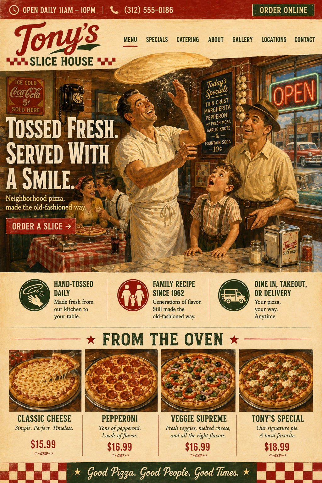
Tony's Slice House — Neighborhood Pizzeria
🎨 A painted, nostalgic illustration instead of a photo — proof this same design system works with a completely different visual language, not just different colors and photos.
📻 Period-accurate props — a rotary phone, a nickel Coca-Cola sign, cars through the window — build a genuine sense of place and history without a word of copy.
🍕 The dough mid-toss overhead and the wide-eyed kid watching it spin captures pure, simple delight — a moment anyone who's ever stood at a pizza counter recognizes instantly.
Could be better: an illustrated hero is a bold, memorable choice, but worth testing against a photo version to see which actually drives more online orders for a business this casual.
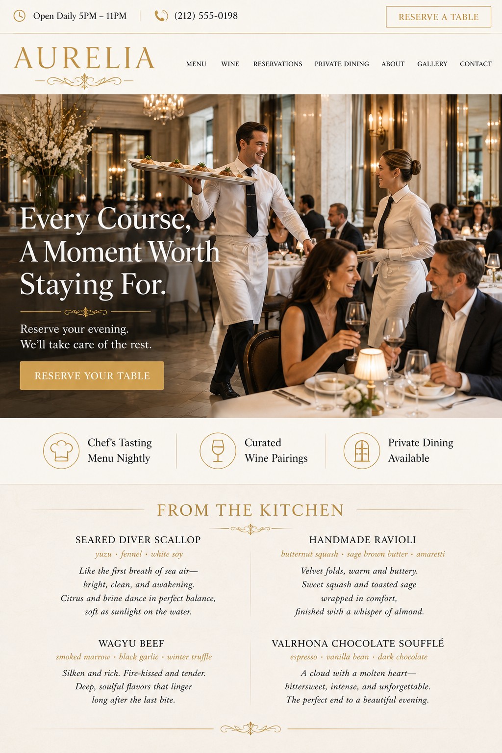
Aurelia — Fine Dining
🍽️ The server caught mid-stride with a tray held high makes the room feel like service is genuinely happening — not a staged, empty dining room shot.
✍️ Dropping food photos from the menu section entirely and replacing them with sensory writing — "like the first breath of sea air" — sells the food better than a picture could, and reads more expensive doing it.
🥂 The couple's genuine laugh over wine, post-meal and relaxed, signals the whole experience rather than just one dish.
Could be better: the nav has seven items for a restaurant this refined — a shorter, more curated menu bar would match the restraint everywhere else on the page.
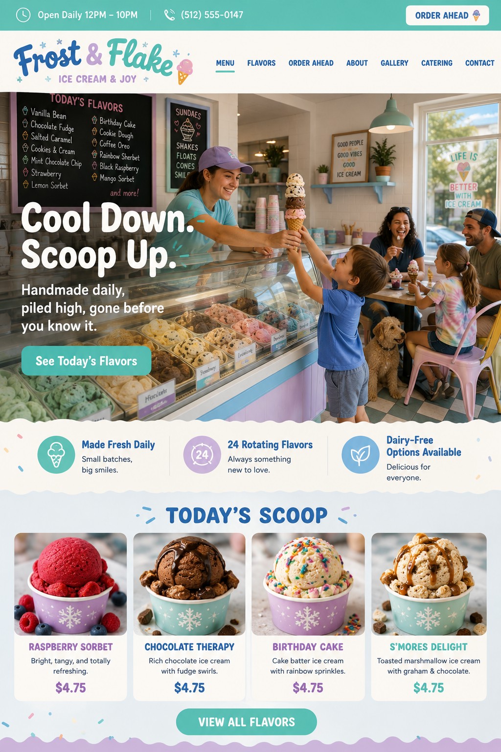
Frost & Flake — Ice Cream Shop
🍦 A kid on tiptoes reaching for a triple-scoop cone he clearly can't handle is the single best "moment" photo in the whole project — funny, real, instantly understood.
🐶 The dog waiting patiently under the table is exactly the kind of unplanned detail that defeats "this looks generated" every time.
🎨 Cool mint, lavender, and sky-blue give this real, distinct brand identity — nothing else in the set looks anything like it.
Could be better: with 24 rotating flavors advertised, a small "today's lineup changes daily" note would set expectations before someone shows up craving a specific one.
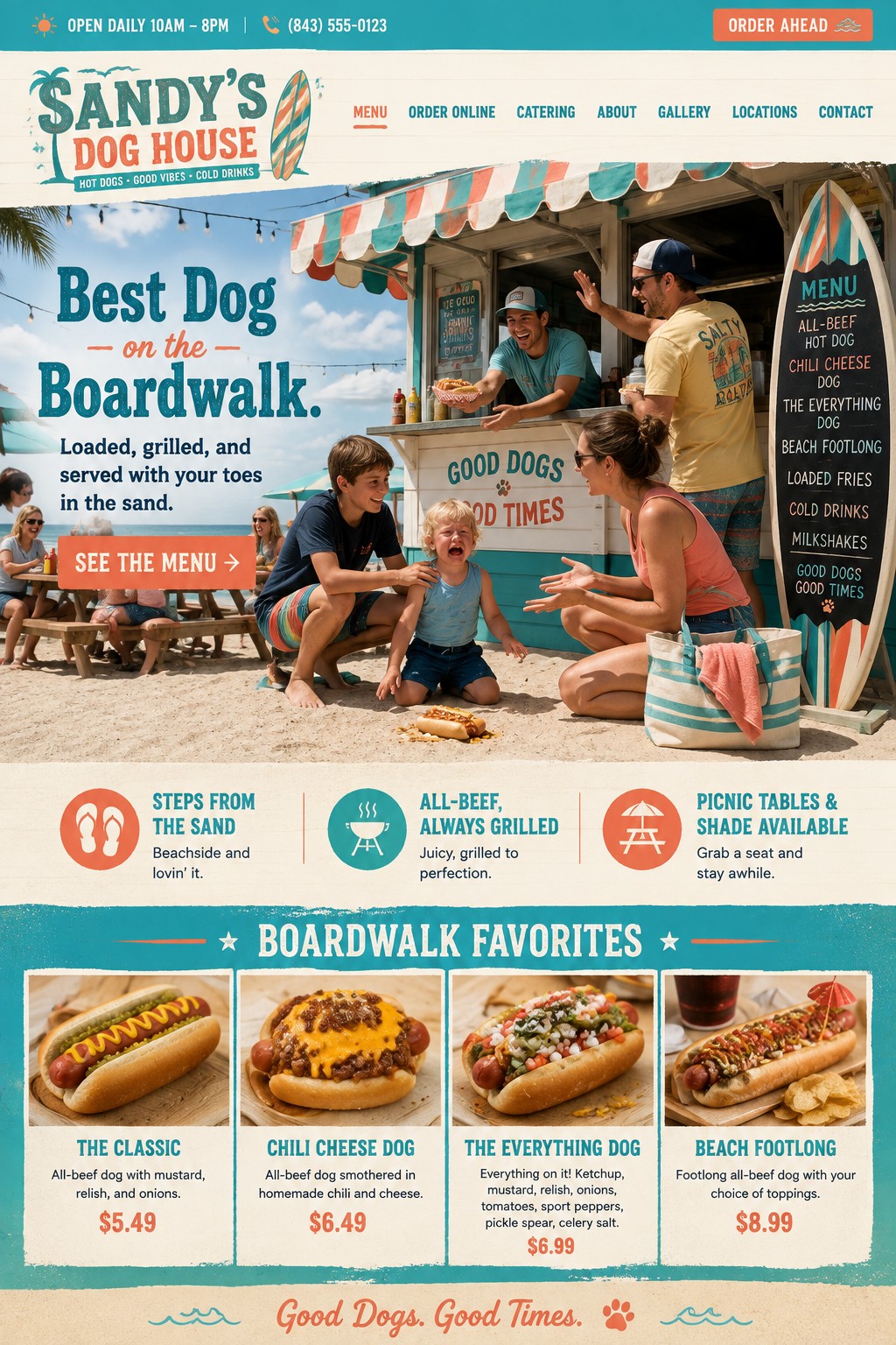
Sandy's Dog House — Beachside Stand
🌭 A dropped hot dog, a crying kid, an older sibling's comforting hand, and a worker already reaching for a replacement — a complete, genuine little story in one frame, setup to resolution.
🏄 The surfboard-shaped menu board is a real, ownable device — nothing else in this whole portfolio has anything like it.
🌊 Real ocean, other beachgoers, and an umbrella in the background make this feel like an actual spot on an actual boardwalk, not a stand dropped onto a stock beach.
Could be better: worth testing whether the emotional hero photo or a simpler "food looks great" shot converts better for a fast, walk-up-decision business like this one.
None of these quite right for your restaurant?
Every site starts as a conversation about what makes your place worth staying for — not a template.