examples trades
Real Sites (Examples), That Work.
In 2026, homeowners don't browse a site — they scan it under pressure, phone in hand, decision made in minutes. Every example below is built around that reality. Here's what works on each one, and what we'd still push further.
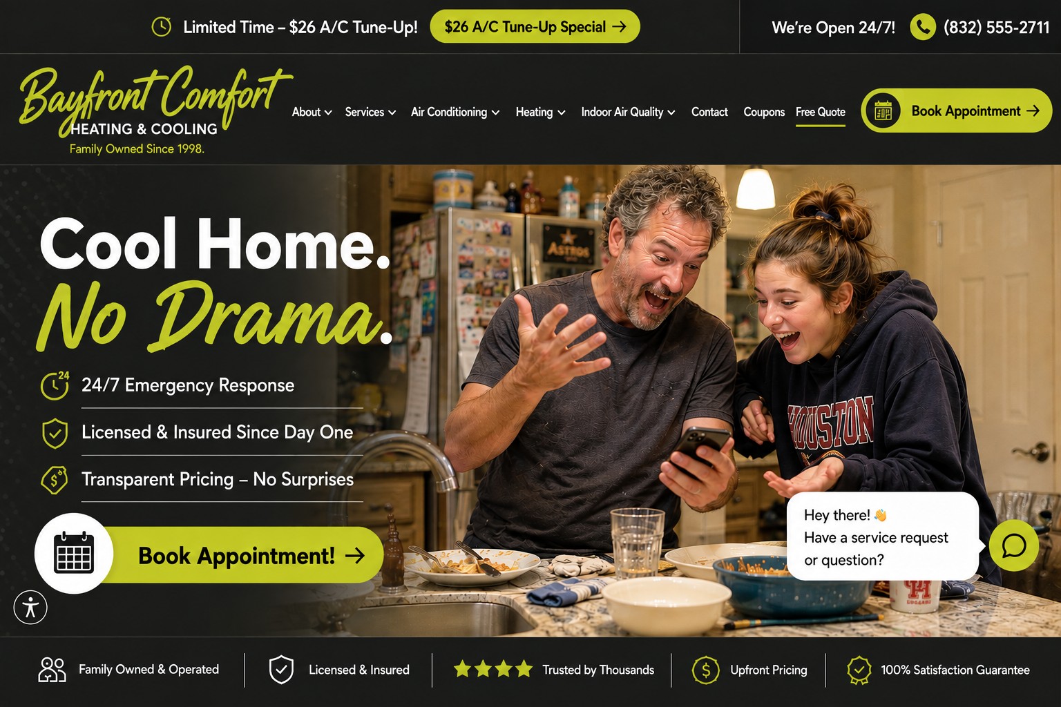
Bayfront Comfort — Tampa, FL
🏠 Real domestic mess — fridge magnets, dishes in the sink — makes the kitchen feel lived-in on a Tuesday, not staged for a shoot.
⚡ Citrus yellow-green against near-black is bold and doesn't repeat any other palette in this set.
💬 "Cool Home. No Drama." says the entire value proposition in four words.
Could be better: the Houston hoodie ties this hard to one city — a real client site should reflect their actual neighborhood, not a placeholder one.
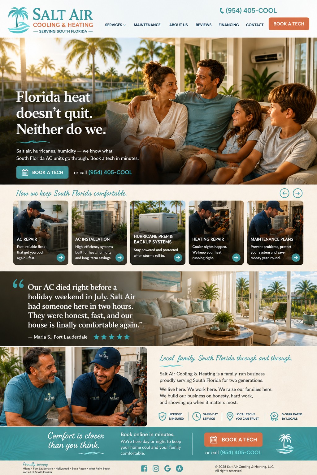
Salt Air Cooling & Heating — South Florida
🌴 Full-bleed hero with the headline overlaid on the photo breaks from the two-column formula entirely — feels closer to a boutique lifestyle brand than a typical trade site.
🌀 "Hurricane Prep & Backup Systems" is a genuine, region-specific service — the kind of local expertise signal that generic service lists never manage.
👨👦 The two-generation crew photo implies legacy and continuity without a single word of copy doing the work.
Could be better: five services in one horizontal scroll strip is a lot to take in on mobile — worth testing a shorter list or a swipe indicator.
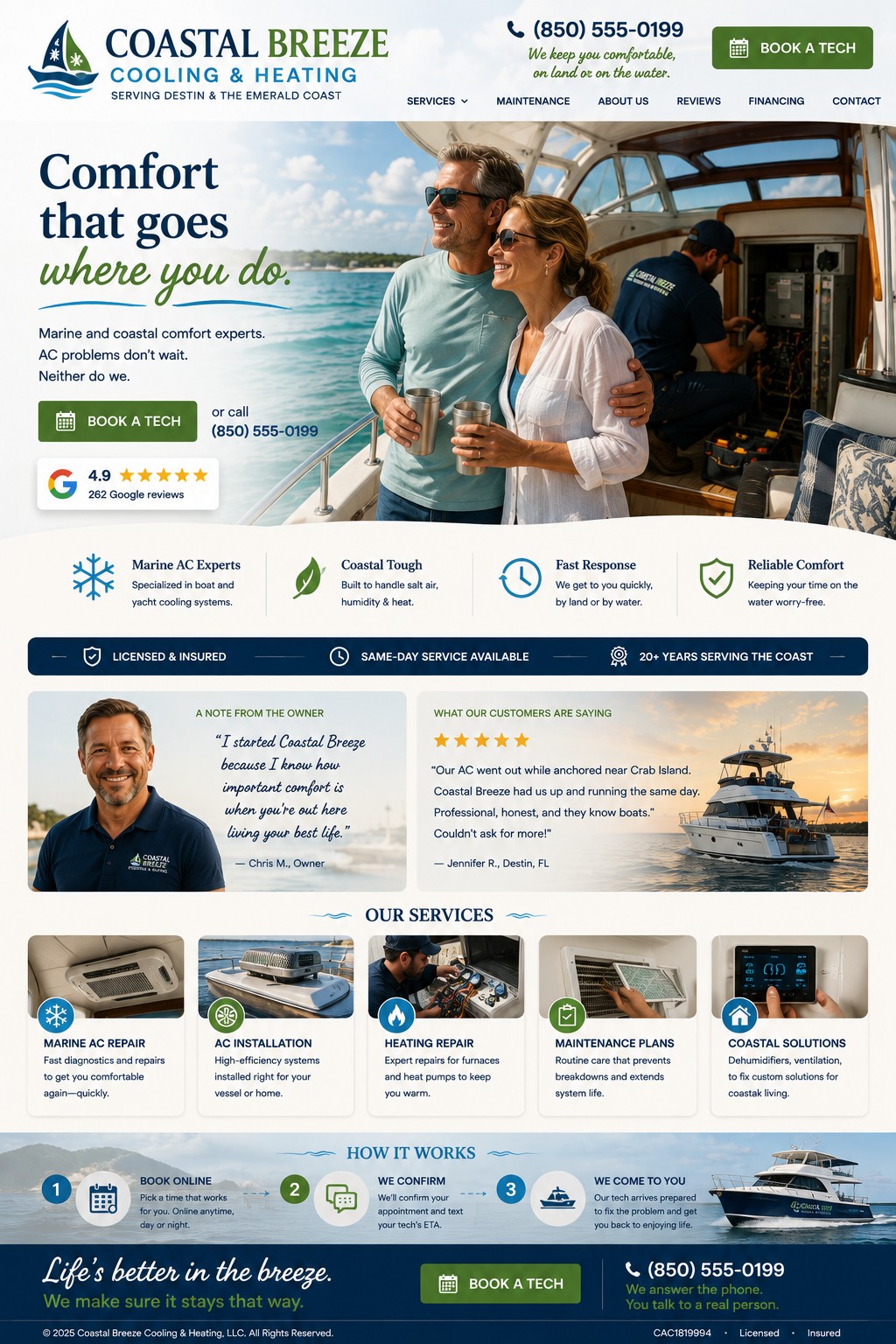
Coastal Breeze Cooling & Heating — Destin, FL
⛵ A completely different niche — marine/boat AC instead of residential — proves this design language can flex into a genuinely underserved specialty market, not just houses.
🍹 The couple's candid, sun-drenched moment on deck, technician working behind them, tells the whole "comfort follows you" story without a word of copy.
🧭 "Comfort that goes where you do" is a tagline that genuinely couldn't work for any other business in this set — real, specific positioning, not a reused formula.
Could be better: worth backing the niche claim with real trust signals — marina partnerships or boat manufacturer relationships, not just a services list.
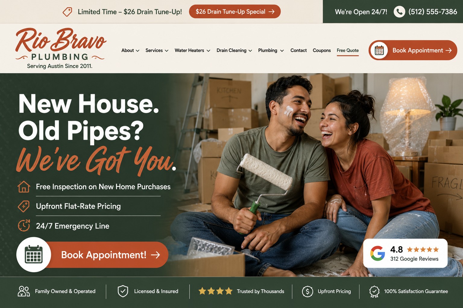
Rio Bravo Plumbing — Austin, TX
📦 Moving boxes, a bubble-wrapped lamp, "FRAGILE" scrawled on a box — this is the most convincingly unstaged photo in the entire set.
🎨 Terracotta and sage breaks completely from the blue/navy formula almost every plumbing site defaults to.
⭐ Swapping the review badge in for a chat bubble proves this design language can flex its trust element without breaking the layout.
Could be better: "New House. Old Pipes?" is clever but a little niche — it may not speak to an existing homeowner mid-emergency.
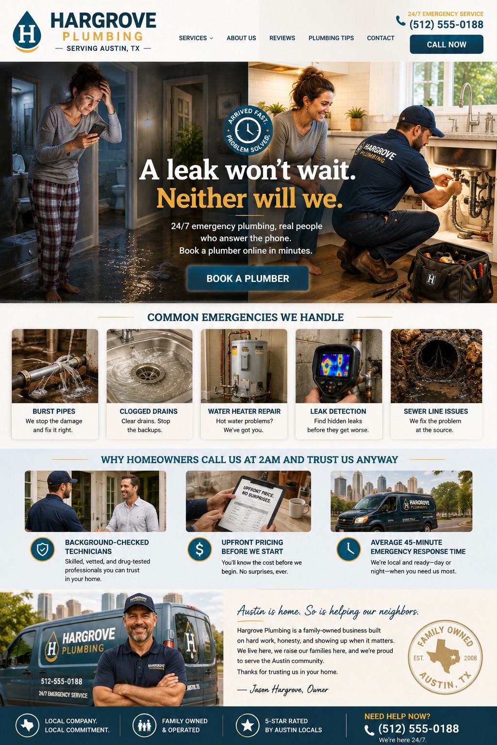
Hargrove Plumbing — Austin, TX
🌙 The split before/after hero is the only design in this whole set built around a full fear-to-relief narrative arc, not just a single warm photo.
📋 "Upfront price, no surprises" shown as an actual clipboard photo is proof over promise — stronger than the same claim as a bullet point.
🏙️ The company van against the Austin skyline plants the "local" flag harder than any badge could.
Could be better: two Austin plumbers in one portfolio is redundant for a real pitch — pick one as the lead example per city.
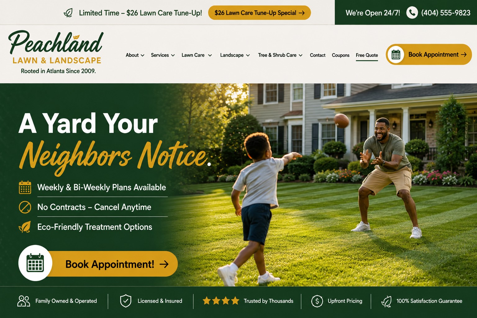
Peachland Lawn & Landscape — Atlanta, GA
🏈 A mid-throw football catch instead of yardwork — smart, since showing the customer mowing would have undercut the service itself.
🌱 The crisp mow-stripe pattern behind them does the "proof of quality" work with zero text required.
☀️ Real motion blur and golden-hour light beat a posed group photo every time.
Could be better: "Eco-Friendly Treatment Options" is a little generic — a specific claim (e.g. "pet-safe, chemical-free available") would land harder.
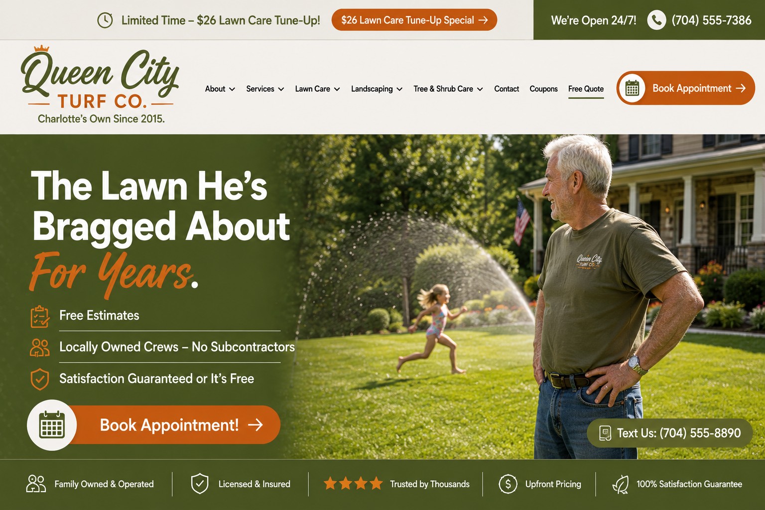
Queen City Turf Co. — Charlotte, NC
👕 The logo shirt on the man in the hero quietly clarifies he's the owner or tech admiring the work, not a customer mowing his own yard.
💦 The sprinkler and a running grandkid in motion gives the photo real, unstaged energy.
📱 A "Text Us" tag instead of a chat bubble or badge — a third distinct trust device across the set, so nothing feels templated.
Could be better: worth an alternate version featuring a younger family too, so the lead image doesn't skew toward one age group.
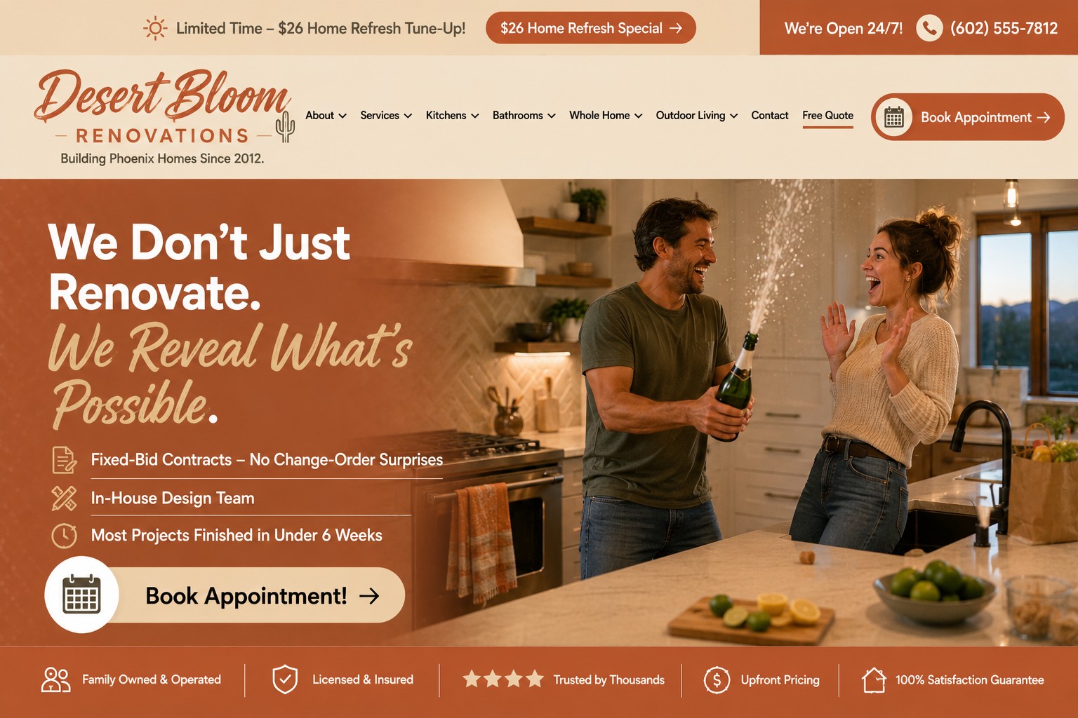
Desert Bloom Renovations — Phoenix, AZ
🍾 The cork-popping reflex shot captures a genuine, unplanned reaction — the best "after" moment in the whole set.
🛒 A grocery bag and a dish towel on the oven handle make the finished kitchen look lived-in on day one, not staged for a shoot.
🌵 A small cactus icon worked into the logo gives it real regional identity without being kitschy.
Could be better: the clay/terracotta palette runs a little dark — worth checking contrast on an actual phone screen.
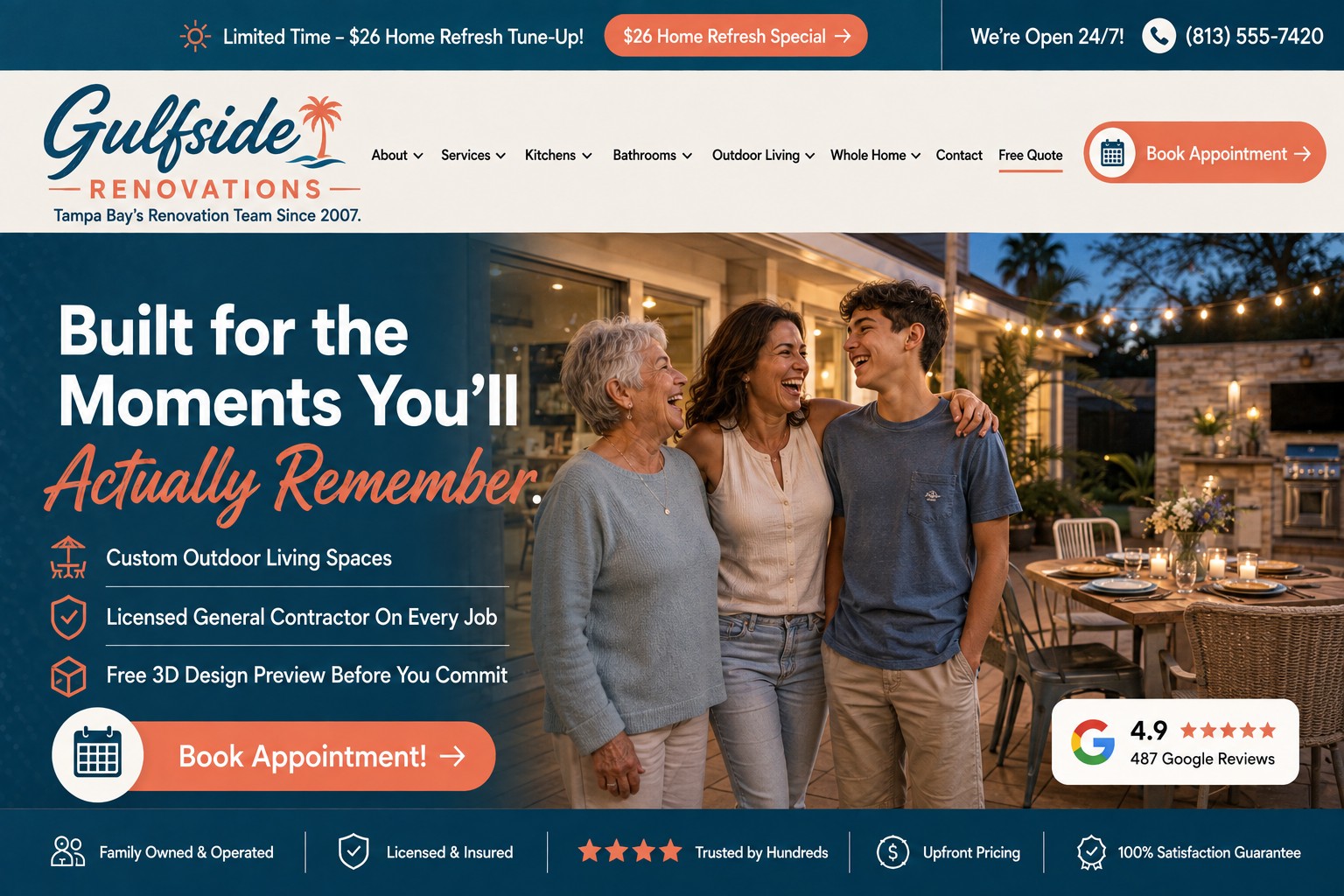
Gulfside Renovations — Tampa, FL
🌆 The twilight string-light photo does double duty — it shows the finished space and sets a warm, aspirational mood at the same time.
👵👩🦱🧑 Three real generations laughing together signals "built for family life," not just a nice patio.
🌊 Coastal navy in the header actually echoes the dusk sky in the hero photo — a rare case of palette and photography reinforcing each other.
Could be better: no mention of storm/hurricane resilience in the copy, which matters a lot to Tampa homeowners specifically.
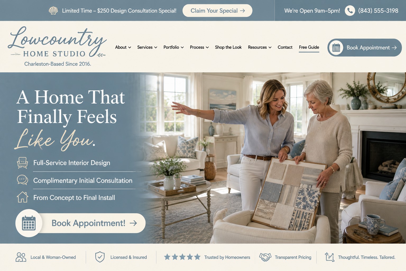
Lowcountry Home Studio — Charleston, SC
🧭 The nav swaps "Services/Coupons" for "Portfolio/Process/Shop the Look" — a small change that genuinely signals a design studio, not a re-skinned trade site.
🧵 The fabric swatch board and an actual gesture toward the room capture a real consultation moment, not a posed handshake.
💬 The bottom trust row ("Local & Woman-Owned," "Thoughtful. Timeless. Tailored.") is fully rewritten, not reused boilerplate.
Could be better: dusty blue on ivory reads a little washed out — a deeper accent color would add contrast without losing the airy feel.
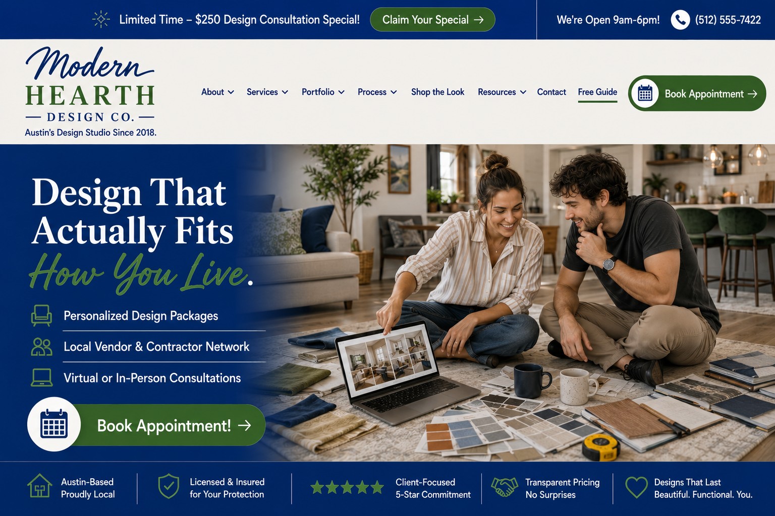
Modern Hearth Design Co. — Austin, TX
🧶 The floor scene — scattered swatches, a tape measure, two mismatched coffee mugs — sells "real design process" better than any showroom photo could.
💻 The laptop actually shows a room mockup on screen — a small detail with a concrete payoff.
🌲 Navy, green, and cream give this real contrast, fixing the "washed out" issue its sister design-studio site ran into.
Could be better: honestly, not much — this is one of the strongest executions in the whole set.
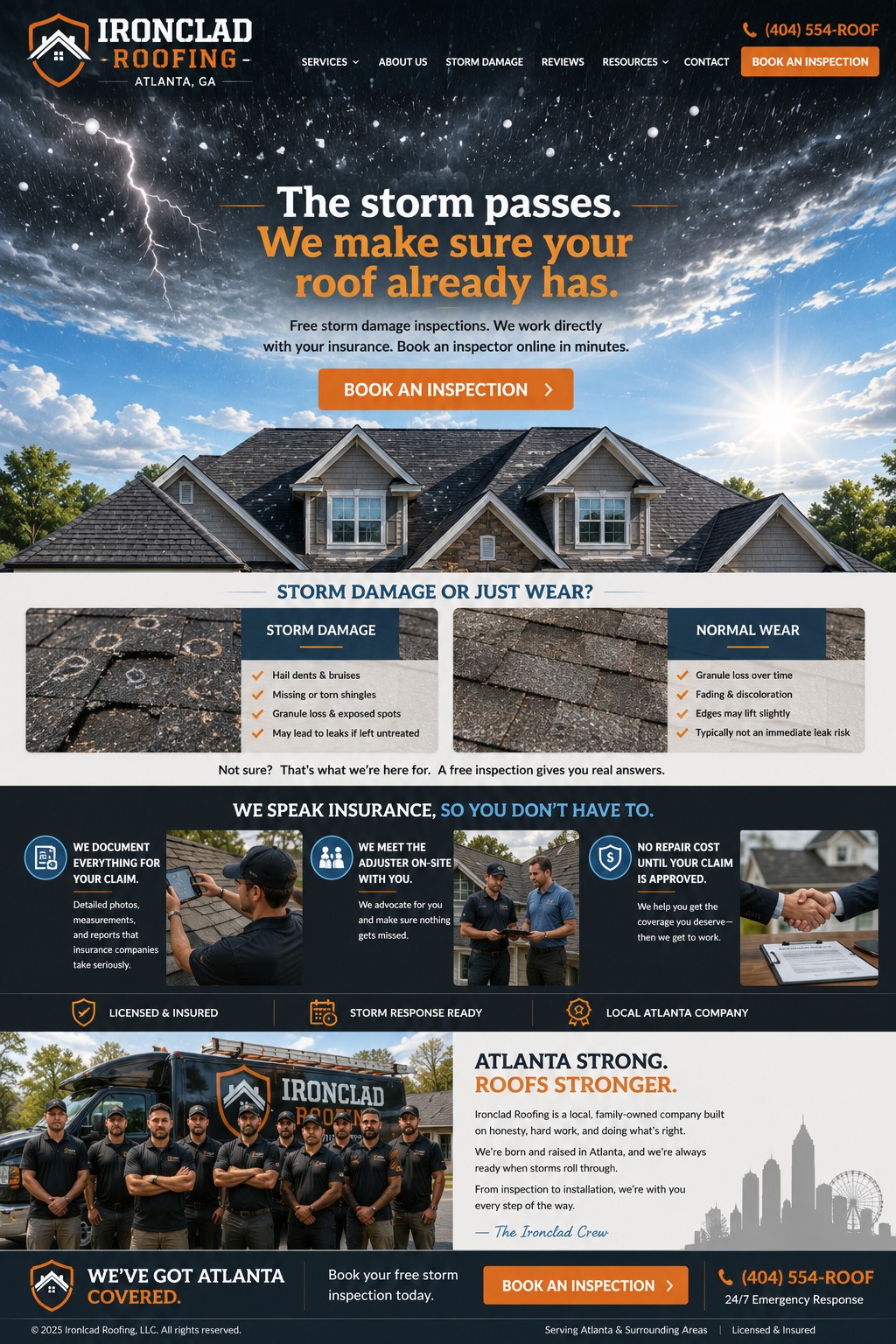
Ironclad Roofing — Atlanta, GA
🌩️ A single continuous sky, storm clearing into sunlight, works as a visual metaphor for the whole service — "before you called, after you called" — without needing two separate photos.
🏠 Real, specific architecture — multiple gables, stone accents — makes it read as an actual project, not a generic template home.
🛡️ "We work directly with your insurance" addresses the single biggest anxiety a roofing customer has, right in the subhead — before they've even scrolled.
Could be better: still runs the same header-hero-cards-footer skeleton as every other trade site here — a genuinely distinctive structure would set roofing apart more than a new palette does.
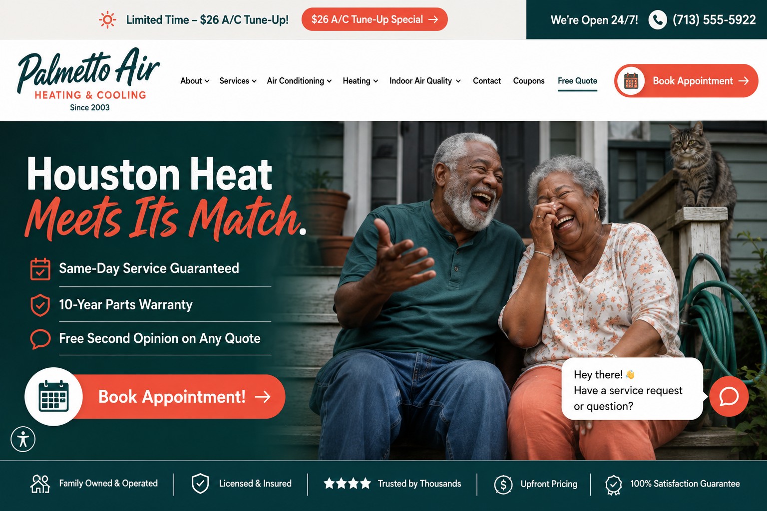
Palmetto Air — Houston, TX
🐈 The cat on the porch railing is the detail that sells it — nobody art-directs a cat into a stock photo, and it's the single biggest reason this doesn't read as generated.
🎨 Deep teal and warm coral is a genuinely distinct palette in a sea of blue/orange HVAC sites — this looks like its own company, not a reskin.
🌟 One Google review badge above the fold does all the trust-building work a whole icon row usually tries to do.
Could be better: the nav is a little text-heavy — the phone number could stand out more against the promo bar.
None of these quite right for your business?
Every site starts as a conversation about what's actually true about your business — not a template.